Most consumers make split-second judgments about businesses based solely on their logos. That single design element sitting at the top of your website isn’t just decoration. It’s your business’s first impression, your credibility badge, and often the deciding factor between a sale and a lost customer.
But you don’t need a design degree or a hefty budget to create a professional logo anymore. AI has completely changed the game. What used to cost thousands and take weeks can now happen in minutes from your laptop.
This guide walks you through everything you need to know about creating a logo online. You’ll learn which tools actually deliver professional results, how to avoid common design mistakes, and the exact steps to turn your business idea into a visual identity that customers remember.
Let’s get started.
Discover And Strategise
Your logo is more of strategising than actual designing. Do your research and get to know who you are as a brand, what message you want to convey and what sets your brand apart from the rest.
You need to personify your brand and determine its personality to do that.
In complex terms, you create your brand identity and brand personality.
And in simple terms, you answer these four questions –
- Who is the target audience?
- How do I want them to perceive my brand?
- What human traits do I want to associate with my brand?
- What is the message I want to convey?
Answering these will help you zero in on some important visual identity elements of your brand, helping you determine the look and feel of your logo.
Here’s an example –
Woodland’s target audience is young people aged 16-30. It wants them to perceive it as an adventurous and outdoorsy brand that encourages exploration (Hence the colour green). Woodland also wants to convey that it encourages exploration and being outdoorsy while also taking care of nature (Hence the tree in its logo).
It’s that simple.
Do A Competitor Analysis
Just developing your own brand identity isn’t enough. You also need to know what your competition is doing and ensure you don’t clash with them. The competitive analysis gives you insight into what kind of logos your competitors have and their designs. It helps you create something that is unique while still being on the same playing field as them.
During this step, find out –
- What type of logo does your competition use?
- What colours do they use?
- What fonts do they use?
- What makes them stand out?
- What designs do they use the most?
By comparing your logo with theirs, you can ensure that it is still unique and memorable.
Learn About The Different Types Of Logos
There isn’t one type of logo that dominates the landscape. Some companies use only text, some use only graphics, and some use a combination of both. Every such logo type has its own name and use case. Here are the most popular logo types:
Wordmark: A simple font-oriented logo with only text. For example, Google.
Logotype: A font-based logo with symbolism built into it. For example, FedEx with its hidden arrow.
Lettermark: A logo type that uses only the initials of your brand name or company name. For example, NASA.
Pictorial Mark: A logo that is based on a simple graphic. For example, the Apple logo.
Abstract Mark: An icon made up of abstract or unrecognisable shapes. For example, the Pepsi logo.
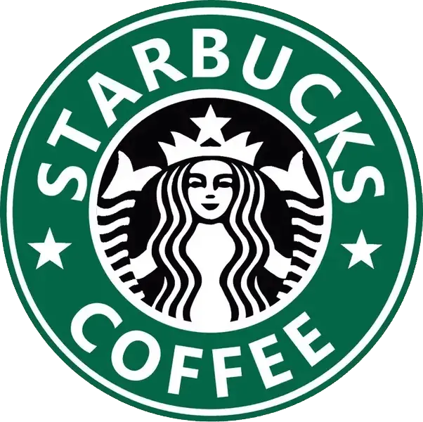
Combination Mark: A symbol or icon that is paired with text to make a logo. For example, the Starbucks logo.
Emblem: A logo type in which a symbol or icon is enclosed inside a shape. For example, the Harvard logo.
Contoured words: A logo type in which the text is enclosed in a shape. For example, the Samsung logo.
There are several more logo types, but the above are the most popular ones. So, before you even start designing your logo, you need to decide what type of logo suits your brand best.
Your previous research should help you do that.
Once you know what type of logo you want, it’s time to start designing!
Choose A Logo Maker Tool
Now comes the designing part. You can make your logo online with a variety of DIY and automation tools available on the internet.
Here are some I personally use –
Tool | Description | Best for | Pricing | |
|---|---|---|---|---|
Canva | An online design tool that includes a logo maker. It’s easy to use and comes with a wide range of templates. | Beginners and non-designers who want a simple logo in a short time. | Free version available. Pro version starts at $12.99 per month. | |
Brandmark | AI logo maker that creates professional, industry-appropriate logo designs from text prompts, with unlimited edits. | Businesses that want control over logo customisation, ongoing edits and commercial use rights without recurring subscriptions. | Basic PNG package: $25 one-time. Source files and branding assets: $65. Premium package with multiple concepts: $175. | |
Looka | An AI-powered logo maker that creates custom logos based on your preferences. | AI enthusiasts who know how to edit AI-generated images. | $96 per year for unlimited changes to the logo. | |
Adobe Illustrator | A professional vector graphics editor widely used for logo design. | Professional designers and businesses that need high-end, complex logos. | Part of Adobe Creative Cloud. | |
Logo.com | An AI-driven logo maker that offers customisable templates. | Quick logo design for startups, small businesses, or personal projects. | Free | |
Midjourney | AI enthusiasts who know how to edit AI-generated images. | AI enthusiasts who know how to edit AI generated images. | Starting at $10 per month | |
Freepik | A platform that offers millions of graphic resources, including logo templates. | Designers who want to start with a template and customise. | Free version available. Premium plans start at €15 per month. |
Some of them are free, and some require payment, but they usually have hundreds of templates and design elements that you can customise to create something unique for your brand. For example, Looka’s logo maker uses AI and puts together logo ideas for you to choose from. Adobe Illustrator is great for creating detailed logos with its vector-based graphics and design tools.
Once you have chosen your tool, it’s time to get down to designing.
Start Designing Your Logo
Here’s the thing about logo design – the fundamentals haven’t changed much over the decades. What made Nike’s swoosh iconic in the 70s still applies today. Good design transcends trends.
You don’t need to reinvent the wheel. You just need to understand what makes logos work and apply those principles to your brand.
Keep It Simple (Seriously)
The best logos are often the simplest ones. Think Apple’s bitten apple or McDonald’s golden arches. You can recognise them instantly, even from a distance.
Simplicity works because your brain processes clean designs faster. When someone drives past your storefront at 35 mph, they need to “get” your logo in under two seconds.
Here’s what simple means in practice:
• Use no more than 2-3 colours
• Stick to one main visual element
• Avoid tiny details that disappear when scaled down
If your logo looks cluttered on a business card, it’s too complex.
Balance Your Visual Weight
Balance isn’t just about centring everything. It’s about how different elements work together visually.
Think of your logo as a seesaw. Heavy elements (like bold text or dark shapes) need to be balanced by lighter elements or empty space. This creates harmony that feels right to the eye.
You can achieve balance through:
- Symmetrical layouts (same weight on both sides)
- Asymmetrical arrangements (different elements that still feel balanced)
- Strategic use of white space
The FedEx logo nails this – the bold “Fed” balances perfectly with the lighter “Ex,” while that hidden arrow adds just enough visual interest.
Choose Colours That Actually Mean Something
Colour psychology isn’t just marketing fluff. Different colours genuinely trigger different emotional responses in people.
Blue suggests trust and reliability (think IBM, Facebook). Red creates urgency and excitement (Coca-Cola, Netflix). Green often represents growth or nature (Starbucks, Whole Foods).
But context matters more than strict rules. A red logo works great for a pizza place, but might confuse people if you’re running a meditation app.
Start with what emotion you want customers to feel when they see your brand. Then pick colours that support that feeling.
Make It Work Everywhere
Your logo needs to look good on everything from business cards to billboards. That means testing it at different sizes and in various contexts.
Typography plays a huge role here. Fancy script fonts might look elegant on your website header, but they become unreadable when shrunk down for social media avatars.
Test your logo by:
- Shrinking it to favicon size
- Converting it to black and white
- Placing it on different colored backgrounds
If it fails any of these tests, you need to simplify further.
The goal isn’t to chase every design trend that pops up. It’s to create something that represents your brand clearly and works across every touchpoint where customers might encounter it.
Mobile-First Logo Design
Your logo might look stunning on your desktop, but what happens when it’s squished into a 50×50 pixel space on someone’s phone? Most people encounter your brand first on mobile devices.
Think about it. Your logo appears as a tiny app icon, gets cropped in social media posts, and competes for attention on crowded mobile screens. If it doesn’t work at small sizes, you’re essentially invisible to the majority of your audience.
How Mobile Changes Everything for Your Logo
Desktop logos have luxury, space, attention, and viewing time. Mobile logos fight different battles entirely.
On mobile, your logo often appears at 16×16 pixels in browser tabs or 29×29 pixels as an app icon on older devices. Those intricate details you spent weeks perfecting? They disappear into pixelated blurs.
What’s worse, mobile users scroll fast. You have milliseconds to make an impression. A logo that needs close examination to understand won’t survive this environment.
Plus, mobile screens have different aspect ratios. Your perfectly balanced horizontal logo might get awkwardly stretched or cropped when it appears in mobile app stores or social media profiles.
Designing for Small Screens and Social Platforms
Start with your smallest use case. If your logo works at 32×32 pixels, it’ll work everywhere else.
Strip away everything non-essential. Complex typography becomes unreadable. Multiple colours blend together. Thin lines vanish completely. Focus on one strong element that captures your brand’s essence.
Consider creating a simplified version specifically for mobile. McDonald’s golden arches work without the company name. Nike’s swoosh stands alone. Your mobile logo doesn’t need every element from your full version.
For app icons specifically, avoid transparency and stick to solid backgrounds. App stores display icons against various backgrounds, and transparent elements often create confusion.
Social media profiles present another challenge. Instagram crops profile photos into circles. LinkedIn uses squares. Your logo needs to work in both formats without looking awkward or losing important elements.
Building Responsive Logo Systems
Create three versions of your logo: full, simplified, and icon-only. This gives you flexibility across different screen sizes and contexts.
Your full logo works for desktop headers and printed materials. The simplified version drops secondary elements but keeps core recognition factors. The icon-only version distils everything down to one memorable symbol.
Test these versions at actual sizes, not just zoomed out on your design screen. Print them small. View them on actual phones. Ask people to identify them from across the room.
Remember, mobile-first doesn’t mean mobile-only. Your simplified logo should still reflect your brand’s personality and values. It’s not about making things smaller; it’s about making them clearer and more impactful at every size.
A startup consultant, digital marketer, traveller, and philomath. Aashish has worked with over 20 startups and successfully helped them ideate, raise money, and succeed. When not working, he can be found hiking, camping, and stargazing.